This is my basic layout for my contents page. Although it is hard to see hear, I will be taking the pink colour used in the masthead at the top and my page numbers from the pink that I used on my front cover on the masthead. This is so that my colour schemes from my front cover can link in with my contents page. After analyzing other contents pages in the previous blog post, I realized that it will be important to use more than one type of font to show variety. I will also be using the font for my masthead from the masthead on my front cover:
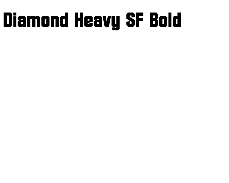
and the font for "CONTENTS" and my section headlines (i.e. "NEWS", "REVIEWS") from the font that I used for my artist name on the front cover to create a link:
I will also be using two pictures on my context page, and whilst I still need to take one of the images, one of the images I will use will be the following:
This is an image that I took at a concert that I went to, and I will edit the picture and sharpen the edges and make the picture a bit clearer and more defined to make it look more appropriate on a contents page.
At the bottom of the page, I will also include "adverts" for my magazines social networking sites, to make the contents page look more porffesional.


No comments:
Post a Comment